Searching for ways to make your web design work effortlessly across mobiles, tablets, and desktops? Responsive design is your key to accomplishing this feat. In this guide, we tackle the essential elements that make a website responsive, offering practical tips and techniques that respond to the myriad of devices your audience uses. Expect to learn about fluid grids, adaptable images, and flexible typography—designed to elevate user experience in a multi-device world without the fluff.
Key Takeaways
Responsive web design is essential in today’s digital landscape, ensuring websites adapt to various devices and screen sizes using fluid grids, flexible images, and CSS media queries.
The practical, responsive design includes crafting fluid grid systems, optimising images for different contexts using techniques like srcset and art direction, and leveraging media queries to refine control and maintain readability across devices.
Usability and navigation must be adapted for various screens, emphasising touch-friendly design for mobile devices, collapsing menus for smaller screens, and employing an iterative design approach for continual improvements.
Understanding Responsive Web Design
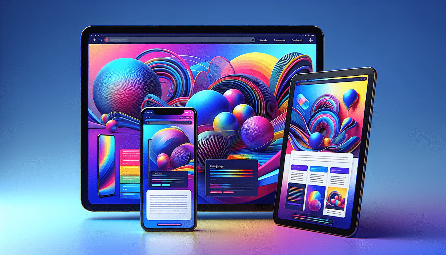
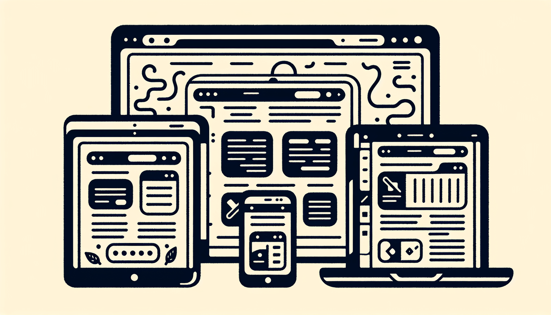
Responsive web design creates web pages that render seamlessly across various devices and screen sizes. It’s akin to responsive architectural design, which adjusts space to accommodate the flow of people within it. But why is this important? In our increasingly digital world, users access the web from an array of devices, each with its unique screen size, resolution, and orientation. Hence, the need arises to prevent websites appearing as scaled-down desktop versions on mobile devices. Instead, they need to be as intuitive and user-friendly as they would be on a larger screen.
Fluid grids, flexible frameworks that enable content layouts to adapt to device size, form the core of any responsive design. For instance, a web page might display a single-column view on a phone and a multi-column layout on a tablet. This adaptability is made possible with media queries, which define specific alterations for different widths and orientations.
The Core Principles of Responsive Design
So, what are the core principles that underpin responsive design? First and foremost, there are fluid layouts. These design structures, media queries and scripts can effortlessly reformat web pages and markup, allowing them to adapt to different screen sizes.
Then, there are flexible images. These are achieved by:
Setting the CSS property max-width to 100%
This allows images to scale up to the entire width of their containing element
They can adapt to different viewport sizes and resolutions.
Rounding out the trio are the CSS media queries. These use the @media rule to apply CSS properties when certain conditions are true. This could involve setting breakpoints for various screen sizes at specific widths, accommodating different device orientations, or enhancing text readability.
Why Mobile Devices Demand Responsive Solutions
In today’s world, mobile internet access is no longer a luxury — it’s a necessity. Mobile web traffic has surpassed desktop traffic and now constitutes the majority of website visits. This trend, coupled with the plethora of screen sizes ranging from:
phones
tablets
desktops
game consoles
TVs
wearables
necessitates that websites adapt to any screen size.
This is where the mobile-first design approach comes into play. By starting with the smallest screen and scaling up to a larger viewport, designers can ensure optimised navigability and responsiveness on mobile devices before scaling up. The growing use of mobile phones for internet access underscores the demand for mobile-friendly websites, prompting the necessity for responsive solutions.
Crafting a Fluid Grid System

Now, we shall explore the core of responsive design by learning how to craft a fluid grid system. Fluid grids are the backbone of responsive design, allowing columns to adjust in width relative to the maximum layout width. This offers adaptability across different screen sizes, ensuring your web content looks great, whether on a small smartphone or a large desktop.
Setting up a fluid grid system effectively is the key to its success. Here’s how to do it:
Define a maximum width for the fluid grid system to prevent the layout from becoming overly broad on large screens.
Divide the layout into columns, with the width of each column expressed as a percentage of the maximum layout width. This ensures fluidity and scalability.
For example, a fluid grid system for a restaurant website could be designed with a maximum width of 1200 pixels, where the layout is divided into 12 columns, each taking up 8.33% of the maximum width.
Implementing Multi-Column Layouts
But how does one go about implementing these multi-column layouts? Enter CSS Multi-column Layout, also known as multicol. This technique allows content to flow into multiple columns, like a newspaper layout, ensuring that the standard document flow is maintained within columns without addressing each column individually.
The beauty of multi-column layouts is their inherent responsiveness. They dynamically adjust the number of columns based on screen width without needing media queries. With the column-width property, multicolour creates as many columns of a specified minimum width as can fit in the container, sharing any remaining space. Columns are guaranteed to be at least as wide as determined by column width unless the container can only do one column. In such cases, the column may be narrower.
Additionally, setting a column count establishes the maximum number of columns into which content can be divided. The break-before, break-after, and break-inside properties can control where content breaks occur to prevent layout issues such as headings at the bottom of a column. An element within a multicol container can span all columns using the column-span property.
Transitioning from Fixed to Fluid Layouts
Another vital step in crafting responsive design is transitioning from fixed to fluid layouts. Fluid web designs adjust to various screen sizes, promoting adaptability from large desktops to small mobile screens. The question then arises: how can this transition be made effective?
The answer lies in understanding element proportions within the entire layout. Ethan Marcotte provided a crucial proportional conversion formula for creating fluid layouts: target/context = result. To apply this formula, divide a fixed unit (target) by the entire width of the original design (context) to get a percentage (result) for the fluid layout. Successfully transitioning to fluid layouts requires understanding element proportions within the entire layout to maintain a responsive design.
Optimising Images for Responsive Contexts

While a picture is worth a thousand words, a poorly optimised image could waste vast wasteloading time and bandwidth. Therefore, optimising images for responsive contexts is crucial to responsive web design. From managing image size and quality to employing art direction techniques, responsive image optimisation ensures the appropriate image is delivered across different contexts.
Adaptive Images, for instance, can be used with static websites and Content Management Systems to automatically create and serve re-scaled images based on the user’s device screen size. It detects the visitor’s screen size, automatically creates caches, and serves appropriately scaled versions of embedded HTML images without needing markup changes.
Responsive image delivery can be enhanced using the srcset HTML attribute within IMG tags. This allows the browser to choose from multiple provided image sizes, ensuring that the most appropriate one is served based on the screen size.
Images within a fluid layout can be made flexible and thus responsive, scaling proportionately to fit the available space by leveraging CSS properties like percentage units for max-width.
Managing Image Size and Quality
Image optimisation is a balancing act. On one side, you have file size, and on the other, image quality. Large, high-quality images can slow down your website, but low-quality images can deter visitors. The challenge lies in striking a balance.
It begins with choosing the correct file format and compression level. Here are some tips to optimise your images for the web:
Choose the correct file format: JPEG is best for photographs, while PNG is better for graphics and images with transparency.
Adjust compression level: Lossy compression reduces file size at the cost of some image data, potentially degrading image quality. Lossless compression maintains image integrity, but files may still be significant.
Use image optimisation tools: Adobe Photoshop and WordPress image optimisation plugins can help you adjust image compression settings and optimise the process for web uploads.
By following these tips, you can ensure that your images are optimised for the web and load quickly on your website.
Services like HiSRC, in combination with Foresight.js, can also improve performance across different connection speeds by serving optimised images based on the user’s bandwidth.
Techniques for Art Direction in Responsive Imagery
Responsive design is not just about resizing images but also entails selecting the most appropriate image for the context. This is where the concept of art direction comes into play in responsive imagery.
To deliver different image versions based on screen dimensions or device resolution, the <picture> element can be used in HTML. This enables the definition of multiple <source> elements for different image files. Art direction in responsive imagery may involve providing different cropped or styled versions of an image for different screen sizes to ensure important features are visible and well-presented.
With WordPress 4.4 onwards, responsive images are supported natively by allowing browsers to choose the most appropriate size from the srcset attribute defined within the <img> tag. The srcset attribute enables the browser to select from images of different sizes, providing the most appropriate image based on screen resolution and viewport size.
Leveraging Media Queries for Refined Control
As demonstrated, responsive web design is a complex process with numerous elements, from fluid grids to flexible images. But one of the most powerful tools in our toolkit is media queries. These CSS3 features let you render content to adapt to conditions like screen size or resolution, defining differing styles for various browsers and screen sizes.
Using media queries, responsive designs can adapt their layout and content for different screen sizes and orientations, ensuring proper display and operation across various devices. Media queries enhance the user experience by allowing for the definition of responsive layouts that cater to both landscape and portrait orientations, hiding unnecessary elements on smaller screens, and swapping out large background images for more appropriate sizes on smaller viewports.
Defining Breakpoints for Responsive Breakpoints
Responsive breakpoints refer to where your website’s content adjusts to deliver the most optimal layout for information consumption. They are used to make adjustments for different screen sizes and ensure the design looks good on all devices. Best practices suggest having at least three breakpoints for web design to cover mobile, tablet, and desktop viewports.
Designers should consider portrait and landscape orientations for mobile and tablet, resulting in five breakpoints. Common industry breakpoints used in frameworks like Bootstrap are set at:
576px
768px
992px
1200px
Utilising Media Features Beyond Width
However, media queries are not limited to adjusting layouts based on screen size alone. Advanced media query techniques can extend beyond screen width to include a variety of device capabilities for responsive design.
Logical operators such as AND and OR (comma-separated values) enable combining multiple media features like width, height, and orientation in one query. With specific media features, designers can target device styles based on characteristics, including orientation, pointer interfaces, and the ability to hover.
Tools like DevTools Device Mode in Chrome assist in simulating devices with various capabilities, such as touch interfaces and high-resolution Retina displays for testing responsive designs, considering the device’s width.
Dynamic Typography for Readable Content
The role of typography in the design and usability of a website is undeniably significant. Hence, dynamic typography is a vital aspect of responsive web design. It involves changing font sizes within media queries or using viewport units to adapt text to varying screen sizes, ensuring readable and engaging content across devices.
Viewport units, such as vw (viewport width), are employed in responsive typography to scale text without needing media queries. Adjusting font sizes is crucial for a truly responsive design to ensure text remains readable on different screen sizes.
Setting Type with Viewport Units
Viewport units offer a dynamic way of handling type in responsive design. The viewport width (vw) unit is based on the viewport’s width, where 1vw is equivalent to 1% of the viewport’s width.
Font sizes set in viewport width units (vw) scale automatically with the browser window size, enabling text to adjust responsively to different screen widths. Scalable typography using VW units improves readability and a better user experience on various devices by adapting text size to the viewport dimensions.
Font Size Adjustments with Media Queries
While viewport units offer a dynamic way of handling type, media queries allow for more precise font size adjustments at different screen widths. This can significantly enhance readability and the overall user experience.
At certain breakpoints, media queries can adjust the font size of webpage elements to enhance the user’s reading experience on different devices. Using media queries, increasing or decreasing font sizes based on the minimum and maximum screen widths is possible, allowing for precise adjustments at each breakpoint.
Design Strategies for Navigation on Various Screens
User navigation significantly impacts their overall experience on your site. Therefore, devising design strategies for navigation on various screens is critical. This includes adapting menus for touchscreens and collapsing menus for small screens, ensuring usability across multiple devices.
Navigation menus should be positioned intuitively, typically at the top or left side of the page. The navigation menu hierarchy should be clear and concise, reflecting the site’s information architecture. Some guidelines for designing navigation menus include the following:
Position the menu at the top or left side of the page
Keep the hierarchy clear and concise
Use dropdown menus sparingly on mobile devices to prevent overwhelming users
Design touch-friendly expandable controls for dropdown menus
Avoid more than two levels in dropdown menus to reduce confusion.
Adapting Menus for Touchscreens
With the rise in touchscreen devices, menus must be designed with touch-friendly features. Menus on touchscreens should have large touch targets to make it easier for users to select items accurately, along with optimised spacing between menu items to prevent accidental taps.
Mobile-friendly navigation patterns, such as hamburger and off-canvas menus, enhance user experience by maximising screen real estate and incorporating intuitive gestures like swiping. Designing with large clickable areas for buttons and sufficient whitespace between links and buttons assists in preventing accidental clicks, an essential consideration following Fitts’s Law.
Clickable menus that activate by tapping are preferred on touchscreen devices, as they do not require hover states, which are not feasible without a cursor.
Collapsing Menus for Small Screens
Collapsing menus for small screens is a technique that can significantly enhance the user experience. It involves simplifying complex navigation structures while preserving depth and functionality. Techniques for collapsing navigation include transforming extensive menus into simpler forms, such as submenus or dropdown menus that are more suitable for small screens.
While collapsing menus, it’s important to preserve the sense of depth and functionality to ensure users can still navigate the website effectively. The collapsed menus should contribute to a sense of order and intuitiveness in the user interface, particularly on mobile browsers where space is limited.
Testing and Enhancing Website Responsiveness
The work doesn’t stop after implementing your responsive web design. Testing and enhancing website responsiveness is crucial to ensure your design is functioning optimally. This involves using tools to assess mobile-friendliness and adopting an iterative approach to design improvements.
Testing the design on various devices is crucial to confirm its responsiveness and visual appeal. Usability testing with real users is necessary to uncover any navigation design issues and make iterative improvements for a refined user experience. Use tools like Google’s mobile-friendly test and Chrome developer tools to asses a website’s mobile-friendliness and responsiveness across multiple screen sizes.
Tools to Test Responsiveness
Testing your website across multiple screen sizes and device/browser combinations is essential to ensure responsiveness. Luckily, there are numerous tools available to assist in this process.
Browser-based tools provide an accessible method for developers to quickly simulate how websites look and function on different screens directly within the web browser. By adjusting the browser width, tools like Google Chrome Inspect and Firefox Developer Tools include features for viewing a site on multiple screen sizes.
Cross-platform testing services are essential to assess how a website performs on various device and browser combinations beyond what’s available in local browser-based tools. Services such as Browser Stack, CrossBrowserTesting, and Testsigma offer live interactive testing, parallel automated tests, and visual screenshot comparisons to ensure platform responsiveness.
Iterative Approach to Responsive Design
An iterative approach to responsive design signifies a cycle of continuous testing, refinement, and adaptation to emerging technologies, devices, and user behaviours. This means responsive web design is not a one-time task but a constant process of testing and refinement to accommodate constantly evolving web standards and device landscapes. Understanding how users interact with the website and making adjustments based on this knowledge is crucial in the iterative design process, ensuring a user-centric focus.
A long-term commitment to responsive design requires adapting to new technologies, devices, and user behaviours to remain efficient and effective in creating a responsive website.
Summary
As our journey through the world of responsive web design comes to an end, it’s clear that mastering this art form is a complex yet rewarding task. From understanding the core principles of responsive design and crafting fluid grid systems to optimising images for responsive contexts and leveraging media queries for refined control, each element plays a crucial role in creating a seamless user experience across many devices.
However, the journey to mastering responsive web design is ongoing. With the continuous evolution of technologies and devices, an iterative approach to design is paramount. As designers, we must continue learning, adapting, and refining our designs to provide the best possible experience for all users, regardless of their device, to access our content. Armed with the knowledge from this guide, you’re well on your way to becoming a master of responsive web design. So, are you ready to take your designs to the next level?
Frequently Asked Questions
What does it mean to be responsive?
Being responsive means reacting quickly to people or events and showing appropriate emotions. It also means being sensitive and sympathetic.
What is the meaning of the word responsively?
Responsively means to react or reply immediately, sympathetically, and in a positive way or to be quick to respond appropriately or sensitively. It involves a positive or immediate reaction to something or someone else.
What is the responsive design approach?
Responsive design is creating websites that adjust to devices like desktops, tablets, and smartphones through CSS media queries, providing an optimal viewing experience for users on any device.
What are the core principles of responsive design?
The core principles of responsive design involve using fluid grids, flexible images, and CSS media queries to create a versatile and adaptable layout.
What is a fluid grid system in responsive design?
A fluid grid system in responsive design allows columns to adjust in width based on the maximum layout width, ensuring adaptability across various screen sizes.